Tuesday, 10 June 2014

Portfolios


Derek Lunn Photographer

http://www.dereklunn.com/

Digital (online) portfolio

Purpose – to promote his wedding photography with a view to securing work in this area.  This is achieved by displaying a good range of wedding images in a range of styles.

Additional – he includes, on the site, a full price list and a description of the different packages available, contact details.

Size – I think there is a good range of images so that we get a good idea of his style of photography

Advantages – Being on  a website, everybody can see it using any internet enabled device.  The layout of the site is very minimal which is good because there isn’t too much information

Disadvantages – Some people may not have access to the internet or may have a poor connection meaning the site won’t load up.  Also, in this case, the site is poorly designed, meaning that the viewer has to zoom in and out a lot to view the images.


Textile Student (Heriot Watt)
Paper based portfolio and sketchbook
Purpose – To showcase her textile work in a manner that allowed people to touch the materials and to see them ‘in the flesh’.
Additional – I spoke to the designer, and she explained that she had arranged the portfolio with her best work at the start.  The portfolio was supported by a sketchbook in which the artist had unfinished work, new ideas that she was developing, and experimental work.
Size – The size of the pieces within the portfolio ranged from A2 to A3, dependent on the size of the material being displayed.  In general the portfolio consisted of images of the material mounted below a sample of the material.  There was no text on the page.  Consisting of approximately 15 pieces, mounted on white card, the portfolio looked tidy and professional. 
Advantages
– The portfolio was very minimalistic and uncluttered, having a neat and tidy appearance.  This meant that your eye was drawn to the creative boldness in the design of the materials.  Having samples of the material included in the portfolio meant that you could actually physically see the material with the naked eye.  (Sometimes a computer screen does not do the material justice)
Disadvantages – The portfolio was large, and would probably have been heavy to carry about.  There would also be a risk that some of the samples might get damaged, and it may have been difficult to replace the work.  The disadvantages with this physical style of portfolio is that it is not as immediately accessible as, for example, an online collection.


Student’s Portfolio 1  (Booklet)
(Provided electronically)
Booklet
Purpose – To showcase the student’s work with a view to progressing in her art/graphic design studies.
Additional – This booklet is much ‘neater’ and more orderly than that of Student’s Portfolio 2.  It lacks any creativity in its layout, having a plain white background to every page, and with samples of his work laid out in a ‘grid’ style.  In my opinion this is a bit dull, with the most exciting thing being the flash of colour at the bottom of each page.  The layout is not creative.  Personally, I don’t like the style of artwork in Section 3, however, had this artist presented this work  in a more creative and exciting manner, It might have made it more interesting to me. 
Size – a convenient booklet size, which is easily held by the reader.  Possibly A5, probably A4.
Advantages – Can be printed multiple times for sending out to numerous places at the same time. 
Disadvantages – Once it is printed, then that’s it !  Any corrections could cost money to fix or change.


Student’s Portfolio 2 ( Booklet)
(Provided electronically)
Booklet
Purpose – To showcase the student’s work with a view to progressing in her art/graphic design studies.
Additional – The layout – Throughout she has used the same font, but has used different sizes and has the text running in different directions. She has used different page layouts, as well.  In some cases an image fills a page, while in others she has numerous images on one page.  The layout could not be described as boring.  In some respects, the booklet is similar to an artists sketchbook, being creative and ‘informal’, seemingly avoiding any sense of neatness or order.  For some this might be appealing, but for others this layout might be too much of a ‘guddle’.  Whatever way you look at it, it is creatively arranged.
Size – a convenient booklet size, which is easily held by the reader.  Possibly A5, probably A4.
Advantages – Can be printed multiple times for sending out to numerous places at the same time. 
Disadvantages – Once it is printed, then that’s it !  Any corrections could cost money to fix or change.


Wednesday, 28 May 2014

Man Ray


Man Ray (born, August 27, 1890 – November 18, 1976 as Emmanuel Radnitzky) was an American modernist artist who spent most of his career in Paris, France. He was a significant contributor to the Dada and Surrealist movements. As well as being a photographer he was a painter, a writer, a film maker and sculpter.

Man Ray himself said photography wasn’t about using or developing a technique for the sake of doing so, but because he felt that doing so genuinely creating interesting images. “I have always preferred inspiration to information”  (Man Ray)

He tried to create surrealist images using solarisation, cropping and various development techniques to create a surreal effect in his photos. Some of these images become known as Rayogrammes, pictures produced on photographic paper without using a camera. This was achieved by placing the subject directly on top of photographic paper and then exposing the whole thing to light. The resulting image is effectively the shadow of the subject.

I like Man Ray’s work cause I can appreciate the skill required to create them, although I don’t approve of the way he has used women in photography.


This here is one of man rays Rayogrammes.   It could be these are tools that he used on a day to day basis in the dark room, however I am also aware that he frequently used objects familiar to him related to his parents occupation as a tailor. The technique used is explained above.


This here is called Les Larmes (Glass tears) (1932). I recognize this image because I have seen it many a times. When I look at this, this actually looks like a film still of a actress of the 1930's but from my research on this image it is actual a mannequin that he has used and  demonstrates his interest in cinematic narrative. 


 This is an image of Ray's assistant Lee Miller. I like this image because of the technique that he has used, it is solarisation which renders part of a photographic image negative and part positive by exposing a print or negative to a flash of light during development. Man Ray and his assistant stumbles on this technique by accident but developed it and used it to great effect as this picture demonstrates. I have heard of solarisation before, in films and pictures and I like it because I think it produces a nice image.


Thursday, 15 May 2014

Imogen Cunningham


Imogen Cunningham (April 12, 1883 – June 24, 1976) was an American photographer , which she was known for taken pictures of nudes,  botanical and industrial landscapes.  Imogen studied chemistry at the University of Washington in Seattle and after being advised by her professor that she should get a scientific background if she wanted to be a photographer. During this time she worked as a secretary producing slides for the botanists at university. It may be this that got her into taking photos of plants.  After graduation Imogen worked in the Seattle portrait studio of Edward S. Curtis, a photographer. Here she learned the techniques of platinum printing, which gave her a greater tonal range in her black and white photography. Her first photographs were of allegorical studies, which she made with artist friends. Characteristics of the photographs were the soft focus, or blurred imagery.  In the 1920’s Cunningham refined her style, taking a greater interest in pattern and detail and becoming increasingly interested in botanical photography, flowers and nudes.  In the 1940s, Cunningham turned to documentary street photography. Cunningham died in 1976 at the age of 93.          
                                                                                                                                                   

                                                                   Nude 1932
When I first started this photography unit, we were shown this in a power point. We were told about composition and I couldn’t understand it when I looked at this one . I was curious about the composition of this one because it was right in the center and from I can remember  from what I was told , the photographer has not followed the traditional rules of composition, such as the rule of thirds, in this image. When i look at this my eye follows the body round.  


Hands and Aloe Plicatilis, 1960
In this photograph here she has used a technique called Double Exposure which combines two different images into a single image.  This is achieved by taking one photograph, and not winding the film on, and then taking another photograph on ‘top of’ the same bit of film.   I think she has used this technique to bring together 2 things which she recognises are similar in shape and form … the human hand and the flowers.  From my research I know that she became interested in taking photos of hands and feet, and this image may be part of that interest.
 
Agave Design 1, 1920s
This is one of her botanical photos, I like this because the way it is positioned and from what I was studying of using shapes in her images, I could see shapes in this – triangles, straight edges creating sharp points. When I started this unit in photography, I couldn’t understand composition and shapes in photographs, however after doing it for a while I can now understand it better and I can see it better in photographs. I perhaps do not fully understand composition but I am starting to recognize well composed images.


Herb Ritts


Herbert "Herb" Ritts (August 13, 1952 – December 26, 2002) was an American fashion and portrait photographer who concentrated on black-and-white photography, often in the style of classical Greek sculpture.
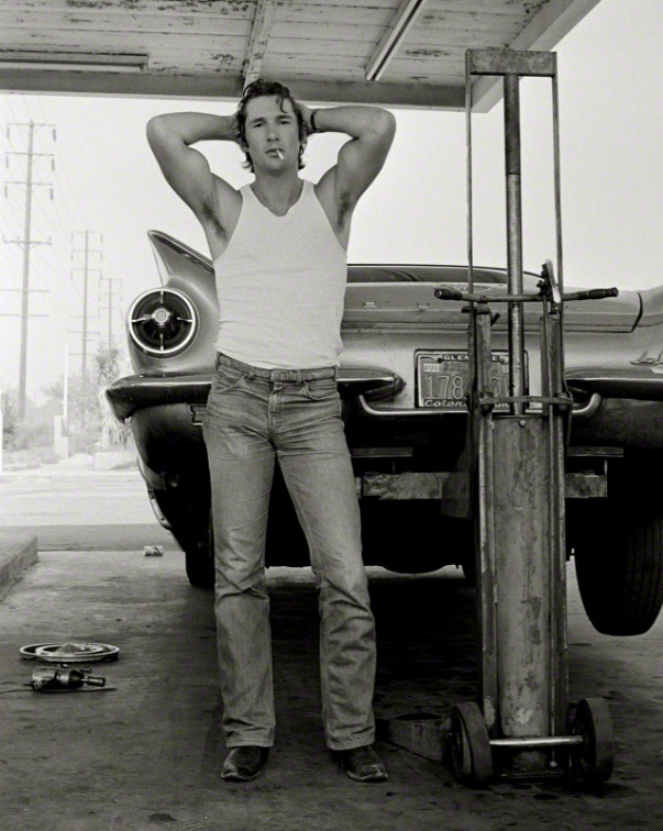
Growing up in California, Ritts was influenced by the scenery and the weather in the state, and this is evident in his photography.  He developed a fondness and an affinity for the wide open spaces the sunlight and the warmth.  An example of this can be seen in his famous photo of Richard Gere.  
He has worked for the likes of fashion magazines such as Harper's Bazaar, Vogue and Elle, as well as doing album covers, music videos and many portraits of famous stars including Richard Gere, Jack Nicholson, Madonna and Cindy Crawford.
In his photography, Ritts uses light and shade and the human form to create interesting images, often using lines and curves to guide the eye into the image.  In some of his images he has the background blurred so that he makes you look at the subject rather than the background.  This may relate to his affinity to wide open spaces. 


In this image, we can see the use of wide open spaces and light.  We can see the light at the top which suggests it is a wide open space, and the darkness of the shadows below the car.  After learning about this, I now like this image, whereas before it done nothing for me !


As this is an album cover image for Madonna’s True Blue album, I already liked this picture as I had seen it before.  When looking at this photograph I noticed that it is blurred in the background, so that it makes the subject come forward.  I think this is created by using a short depth of field.  This is related to aperture. 
Also, the way he has placed the lights, I presume he has put a light right above her as it looks like there is a light shining down on her face … you can see this because of the shadows under her chin and ear.  The way he has made Madonna stand may be influenced by his interest in Greek sculpture, and by throwing her head back, had made her chin and neck more noticeable, which I think makes the picture much more interesting.  In this image, Ritt’s use of line and form has drawn my eye into the image.

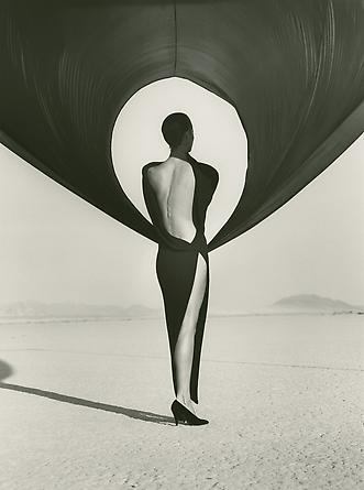
  This photo was taken outside, reflecting his interest in wide open space. I like the strong contrast of the image, making the subject stand out against the negative space.  In particular I like the use of form to create the circle around the subject. 


Tuesday, 29 April 2014

David Hockney


David Hockney (born 9 July 1937) was an English painter, draughtsman, printmaker, stage designer and photographer.  In this review I am going to focus on his photography. In the early 1980’s Hockney started to produce photo collages calling them “Joiners”. The reason for this was he did not like the way other photographers took photographs , using cameras with wide-angle lenses . He didn’t like these photographs because he thought they looked somewhat distorted, frozen and didn’t have life the way a drawing and painting did. Using a Polaroid camera he took lots of individual photographs of the subject while it was moving around.  He done this so it would show the subject from the camera’s perspective as the subject moved around the camera. He arranged them, sticking them on card, thinking about the composition, line and form that drawings and paintings had. He first produced them from Polaroid prints and then to 35mm commercially processed colour prints. These photo collages were like Cubist compositions made from the photos.  This was something that Hockney aimed for.  He also created portraits consisting of many photographic details of the sitter. In his later work he started to move around the subject instead of the subject moving around him. I like these photo collages because he takes them all from different view points, so I think you get to see a ‘fuller’ picture.  
I would like to try to include some images using this technique in my final 8 images.
 
Below are a few of Hockney’s images.
 
 
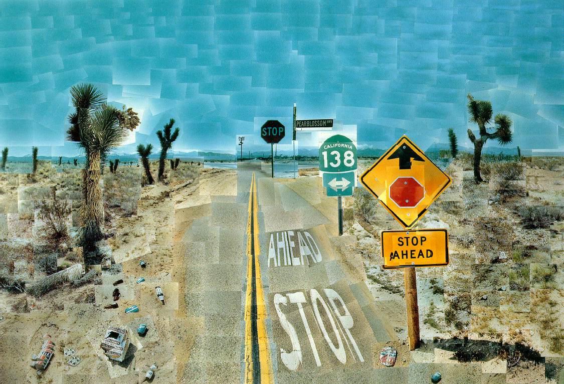
Pearblossom Highway, 11th-18th April 1986, photographic collage, 77x112 1/2 in. 
 
 
This here is Pearblossom Highway.  I like this because of the view, the American road way, the signs, trees, the rubbish on the ground, everything. Apparently when he did this he took roughly 800 hundred photographs. I like the composition, and the fact that it is clearly a sunny, hot day. You can see everything clearly because of the technique he used. When I did a bit of research on this, it is clear that this was created during the time when HE was moving around the subject, rather than the SUBJECT moving around him. This is what gives this image it's perspective. Everything in the image was taken when he stood very close to it, and then arranged it to make it look like you were looking at it from the one viewpoint. This makes you feel involved in the image. In particular I do like colour of the sky and research suggests that he aimed to create a specific shade of blue, similar to paintings.


Robert Littman Floating in My Pool, Oct. 1982 photographic collage, 22 1/2 x 30 in.
 
 
I presume this is a photograph of Robert Littman in his pool as this is what the image is called.  I like how he had done the composition for it, where he has taken the photograph of the man’s body and the fact that it is in a pool in a hot country … it makes me feel like I want to go on holiday !  The image is calm and peaceful, and I like the shade of blue of the pool.


Mother I, Yorkshire Moors, August 1985 Photographic collage


This is one of his many portraits of his mother. When I first saw his work it was a portrait of his mother and I like the way he did the photographs so that is what has inspired me to do this review. When looking at this photograph in particular at first I thought it looked quite unappealing, because of the closeness of her head, and the fact that it is only her head.  When you look more closely, however, you get to see her face from different viewpoints, and I find that I do like it.
 
Here is some more of his work I like


Thursday, 20 March 2014

An Experiment

While visiting the National Gallery of Scotland on a college trip this is a photo I took of just in front of the gallery. I took this because I liked the way the hills were shaped and how you could see the refection of the hills and trees on the pond because of the way the sun shined on the pond. This is the photo in colour.


 I wanted to experiment with the colour, making it black and white, so this is what I done. I first took this photo and put it on Microsoft office 2010 and went to edit photos. I went to saturation and then I turned the saturation to -100 so it took all the colour away, it ended up looking like this.


After doing that I decided I wanted to play around with the brightness, contrast and mid tones to see what it looked like. First I experimented with the brightness, turning it up all the way so it was really bright and then really low so it was really dark and then done the same thing again with the contrast and mid tones. After doing this for a while I ended up with this.
 
 
Here I left the brightness at -5, contrast at 15 and mid tone at -2. When I turned the contrast up, the ground and the pillars at the front became darker and so to me they stood out more so they were the first things i noticed when I looked, and also the pond became a little bit darker to. As for the hills and the trees, no matter which way I turned the contrast, brightness and mid tones they either became really dark or just grey, so they were blending into the sky so it was harder to see the trees and the hills clearly. I don't think the colour, black and white or tonal values I think its called is very good, or even the composition, but it was just an experiment.


Tuesday, 4 February 2014


This is my review about Louise Bourgeous who currently has an exhibition at the Gallery of Modern Art in Edinburgh. Many of her pieces were  different media including sculpture, etching, lithograph, and drawings.  Most of her works didn’t really appeal to me because, at the minute, sculpture is not an art form I have explored. 

However one sculpture DID catch my eye – “couple 1”.

I choose this because of the way the man and woman were holding each other, it looked very caring, and caught my eye. To look at this it didn’t really stand out but after reading why she did this, the message behind it became clear.

I went to the exhibition with no real expectations having never studied this artists work. As I walked through the exhibition most of it didn’t appeal to me.  I found it vulgar and it didn’t connect with me in any way.  Couple 1 on the other hand stood out to me. Initially it was interesting to me because of the position of the characters. It was the just the position … the woman was cuddling the man. It looked very caring in contrast to the other pieces.  On reading the information panel, however, I was surprised to discover that it may not be as positive as it first looked.  The female figure embraces the man in a gesture that could suggest tenderness, which I first thought or however it could also suggest dependency or domination.

As I continued through the gallery, I found myself appreciating the meaning of the works rather than the work itself. I’m never going to love her work, however now that I have an understanding of the message behind the work, I find myself warming to it a little bit.

Wednesday, 15 January 2014


This is my review of the artist Roy Lichtenstein. Roy Lichtenstein was an American artist and was part of the Pop art movement of the 1960’s.

He used comic strips cartoons for his work, drawing on the kind of imagery that was popular with the public at that time. He would take one of the pictures from the comic strip, working on just one frame.  What he would do would be to create a small sketch of the composition, changing it slightly so that it became a ‘new’ piece of work.  He would then create a larger image by projecting an image of the size wanted onto the canvas, and sketching it on. He then used a technique called Ben-Day dots.  This printing technique involved placing a sheet of steel with holes punched through it onto the canvas, and then rolling oil paint onto it, finally taking a toothbrush to rub the paint  through the holes.  The colours he used were the primary colours red, blue, yellow and the colour black.

He also used Magna which is a type of acrylic paint in his work and you can see this in his most famous works, ‘The Drowning girl’, ‘Wham!’, and “in the car”.

I like the technique although I have never done it before, but from what I have seen, from some research, the technique looks enjoyable.

I chose this artist to look at because I liked his work, and have done since I was young , I have always wondered how he did his artwork. I like his use of bold colours, and I think the comic strip style is very striking; the fact that the face fills the frame. I like the fashion of that particular era, and Lichtenstein’s work  appears to  reflect the changing social scene, with the bold colours reflecting more liberated times. 


  Here is a drawing that I did of Roy Lichtenstein's ‘Crying Girl’. Trying to get the proportions of the face, the eyes, and the hand in the right position was difficult, but overall I really enjoyed doing this.


Here is another attempt of mine, this is Liensteins ‘In the Car. Again I found getting the correct proportions difficult